This page is in progress -
Why This is Important
Descriptive headings and labels help organize and describe the content to screen reader users and people with cognitive disabilities.
Blind and visually impaired people use screen readers to interact with websites and apps. A screen reader is a type of assistive tech that converts things on screen to audio and/or braille. It's important that things are understandable and interactive to screen readers.
Keyboard accessibility is essential for people who do not use a computer mouse (which might be because they have unpredictable or very specific movement due to a motor disability). Many Blind and visually impaired people also use keyboard interactions in order to use their screen reader.
Error support is accessible to people with a diversity of disabilities. A cognitive disability might affect how a person perceives and understands things. A physical disability might lead to unpredictable movement. Other factors such as environment, stress, and multi-tasking may also lead to errors.
In order to be accessible, gestures and interactions must account for people with physical and motor disabilities, who might have unpredictable or very specific movement.
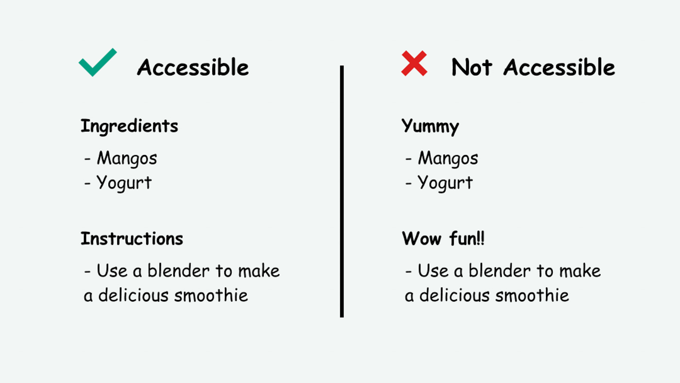
Screen reader users are better able to interact with a page when headings and labels are clear and descriptive. These are also accessible for people with reading or memory disabilities because they make reading more organized and predictable.
This references WCAG criteria 2.4.6 Headings and Labels (Level AA) and 2.4.10 Section Headings (Level AAA)
Level AAA compliance is considered more difficult to meet because it requires more resources to fulfill. It also might encompass conflicting access needs (meaning what is accessible to some might be inaccessible to others). Use your best judgment of your target audience and your team's capabilities to determine if this is a pragmatic goal to reach.
How to Implement This
This is tied to the following guidelines:
- Define information, structure, and relationships in markup
- Label elements and give instructions
- Ensure the programmatic label matches the visual label
Taking into account the other guidelines, here are the steps you can take to implementing this:
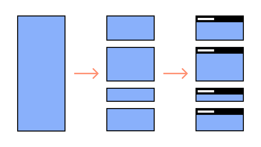
- Divide the content into sections
- Give each section a heading that describes the essence of its content
- Make sure the headings are written in order (h1, h2, h3, etc.) without skipping or going in reverse
- Give each interactive element a label that describes what kind of user input it’s asking for (e.g. name, date, time, etc.)
- Make sure the label is both visual and programmatic
A long page full of content can be overwhelming to everyone, especially to screen readers. Breaking up content into sections and providing headings help people navigate and understand where they are. Screen reader users often use headings to skip from one section to the next, so having descriptive headings is very beneficial.
Here is an example of descriptive headings written in proper order:
<h1>What I Do When I Have the Munchies</h1>
<h2>Eat Everything I Can Find</h2>
<h2>Cry and Mope for Food</h2>
<h3>When Crying Works</h3>
<h3>When Crying Doesn’t Work</h3>
<h2>The Best Cure: The Bagel Shop</h2>
Here is an example of a properly labeled form input, as noted by MDN Web Docs:
<input id="snack-1" type="checkbox" value="banana"/>
<label for="snack-1">Bananas are my favorite</label>
Some people get rid of the label entirely and only use a placeholder to prompt users. While the thought of injecting more personality is great, this leads to confusion when users move focus to the text input because the placeholder disappears. Now it doesn’t have a label for Blind or sighted people.
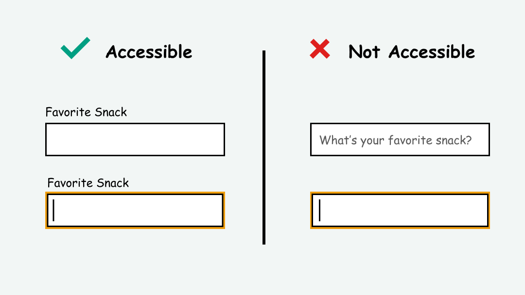
Placeholders are also potentially confusing because sometimes people can mix them up with actual content. It’s that feeling of, “Did I fill that out already?” that can come especially with long forms. It’s best to avoid them or use them sparingly. And no matter what, always use a label.
How to Test This
- Use automated testing tools such as Deque Axe, IBM Accessibility Checker, and tota11y to test for the presence and correct order of headings and labels.
- Manually check that these headings and labels are descriptive and match the content they are connected to.