This page is in progress -
Why This is Important
Descriptive link text helps screen reader users and people with cognitive disabilities differentiate between links.
Blind and visually impaired people use screen readers to interact with websites and apps. A screen reader is a type of assistive tech that converts things on screen to audio and/or braille. It's important that things are understandable and interactive to screen readers.
Keyboard accessibility is essential for people who do not use a computer mouse (which might be because they have unpredictable or very specific movement due to a motor disability). Many Blind and visually impaired people also use keyboard interactions in order to use their screen reader.
Error support is accessible to people with a diversity of disabilities. A cognitive disability might affect how a person perceives and understands things. A physical disability might lead to unpredictable movement. Other factors such as environment, stress, and multi-tasking may also lead to errors.
In order to be accessible, gestures and interactions must account for people with physical and motor disabilities, who might have unpredictable or very specific movement.
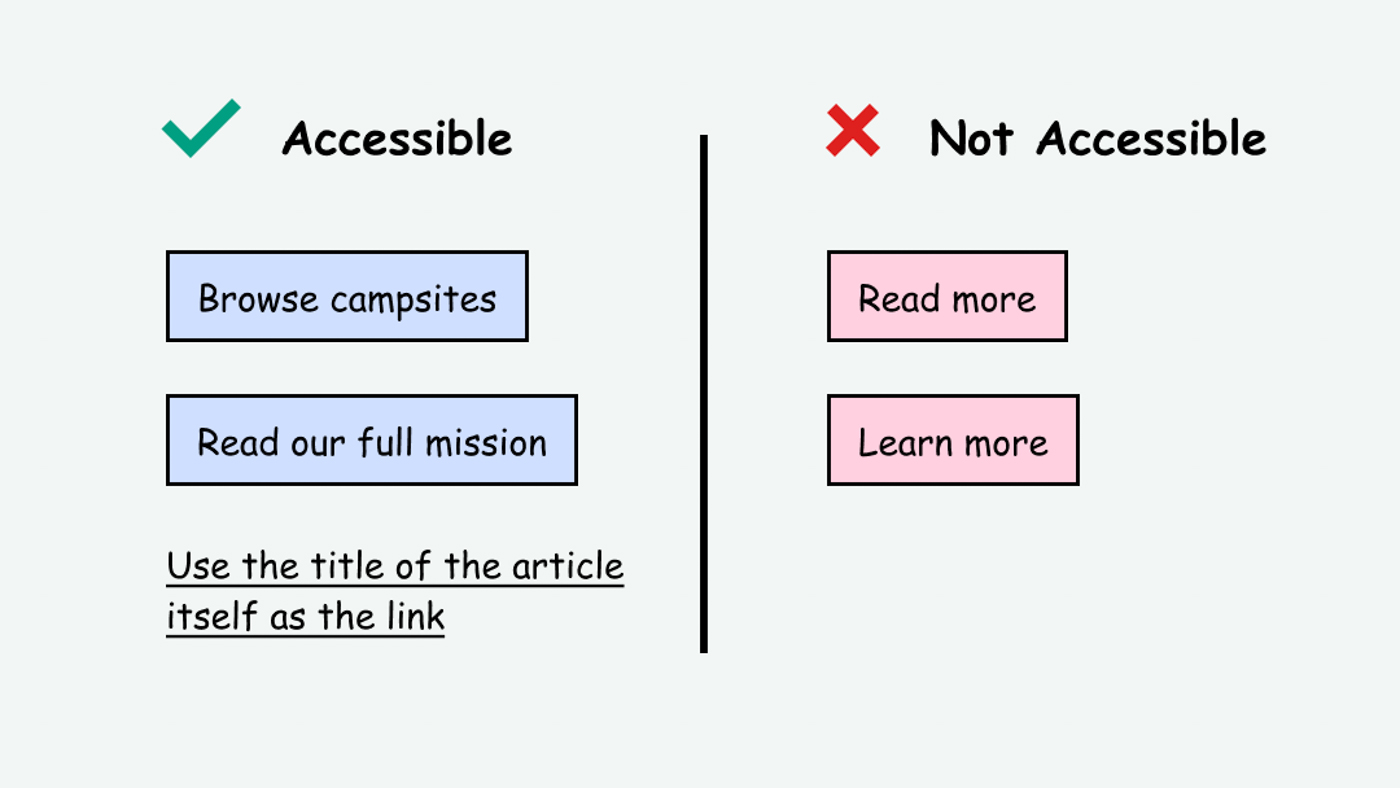
Screen reader users often interact with the page by tabbing through headings and links. If the entire page is a wall of "learn more" links, then it becomes tedious to find which link relates to what. Generic link text such as "learn more" or "read more" is also ambiguous and doesn't explain what will happen if you click on it. This can potentially create uncertainty and cognitive strain.
This references WCAG criteria 2.4.4 Link Purpose (In Context) (Level A) and 2.4.9 Link Purpose (Link Only) (Level AAA).
Level AAA compliance is considered more difficult to meet because it requires more resources to fulfill. It also might encompass conflicting access needs (meaning what is accessible to some might be inaccessible to others). Use your best judgment of your target audience and your team's capabilities to determine if this is a pragmatic goal to reach.
How to Implement This
Nielsen Norman Group (aka NN Group, a great reference for usability) recommends 3 solutions to this in "Learn More" Links: You Can Do Better
- Use keywords that describe the link’s destination.
- Retain the Learn More format and add descriptive keywords.
- Convert the preceding-paragraph heading into the only link.
In all cases, Ensure the programmatic label matches the visual label.
1. Use keywords that describe the link's destination
Instead of “Learn more,” your button can say something actionable with keywords such as “Rent a tool” or “Share your photos with us.”
This is a very effective method, though it requires some skillful copywriting. NN Group recommends front-loading the text by putting the most relevant keywords in the beginning. This makes the links more easily scannable, available in case they are cut off, and more optimized for search engine results pages (SERP).
2. Retain the Learn More format and add descriptive keywords
Instead of just saying “Learn more,” your button can say “Learn more about birds” or “Learn more about pasta.”
This is a very easy and straight-forward way to make links more accessible. The downside is that the links are now longer and take up more space. They also may potentially be truncated before the keywords are visible.
3. Convert the preceding-paragraph heading into the only link
This is my personal favorite. Using a heading as the link text instead of adding another link is very efficient for both copywriting and visual design. It also works well for elements that fit in cards or tiles. A news article is a great example because news sites often have a list of several articles, all of which already have unique titles for documentation and readability purposes.
Apply this to emails, events, and social media
The need for descriptive link text is not limited solely to websites and apps. This rule also applies to other situations where you may be adding links, such as with emails, event descriptions, and other social media.
Here is an email with poor link accessibility: Hello! I hope this email finds you well. See here for a cool video about pandas and here for the song Panda by Desiigner.
Here is an email with good link accessibility: Hello! I hope this email finds you well. Check out these cool youtube links. This is a cool video about pandas here and the song Panda by Desiigner here.
Interesting further reading
How to Test This
- To start, find any links that say "Learn more" or "Read more." Make note of these as they will likely need to be improved.
- Create an inventory of all the links. Make note of any links that are difficult to understand out of context.
- Make note of any links that have a different destination but have the same text. These will need to be changed.