This page is in progress -
Why This is Important
Use simple visual styles to make text easy to read for people with visual and reading disabilities.
Blind and visually impaired people use screen readers to interact with websites and apps. A screen reader is a type of assistive tech that converts things on screen to audio and/or braille. It's important that things are understandable and interactive to screen readers.
Keyboard accessibility is essential for people who do not use a computer mouse (which might be because they have unpredictable or very specific movement due to a motor disability). Many Blind and visually impaired people also use keyboard interactions in order to use their screen reader.
Error support is accessible to people with a diversity of disabilities. A cognitive disability might affect how a person perceives and understands things. A physical disability might lead to unpredictable movement. Other factors such as environment, stress, and multi-tasking may also lead to errors.
In order to be accessible, gestures and interactions must account for people with physical and motor disabilities, who might have unpredictable or very specific movement.
Text should be styled in a way that’s easy to read, especially for people who are Blind or visually impaired, have dyslexia, or have a type of reading or learning disability. Additionally, so much of what we look at today is on a digital screen, which can cause a lot of eye strain. Creating a pleasant reading experience helps improve reading for people with vision correction.
This references WCAG criteria 1.4.8 Visual Presentation (Level AAA) and 1.4.12 Text Spacing (Level AA).
Level AAA compliance is considered more difficult to meet because it requires more resources to fulfill. It also might encompass conflicting access needs (meaning what is accessible to some might be inaccessible to others). Use your best judgment of your target audience and your team's capabilities to determine if this is a pragmatic goal to reach.
How to Implement This
Visual Presentation
WCAG recommends that a mechanism is available to display text in the following ways:
- Foreground and background colors can be selected by the user.
- Width is no more than 80 characters or glyphs (40 if CJK).
- Text is not justified (aligned to both the left and the right margins).
- Line spacing (leading) is at least space-and-a-half within paragraphs, and paragraph spacing is at least 1.5 times larger than the line spacing.
- Text can be resized without assistive technology up to 200 percent in a way that does not require the user to scroll horizontally to read a line of text on a full-screen window.
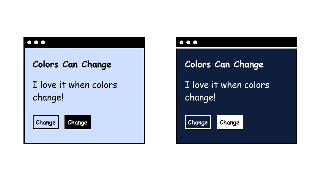
Foreground and Background Colors
Having colors that can be customized by the user is helpful because sometimes people find different color combinations easier to read (for example - dark mode, light text on a dark background).
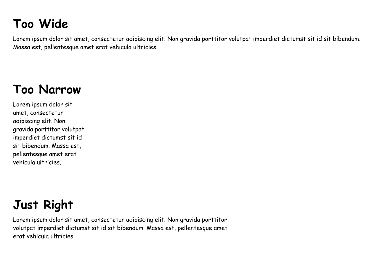
Width, also known as Line Length
The width refers to the optimal column width of a block of text. This is referred to as “line length” in graphic design. If the line length is too wide, it makes it difficult for the reader to focus. If it’s too narrow, it forces the reader’s eyes to move constantly. WCAG recommends a width of 80 characters.
Text Alignment
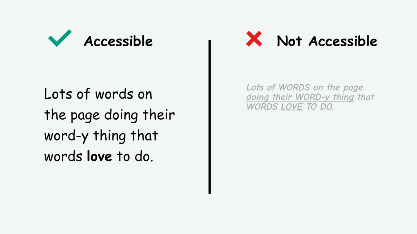
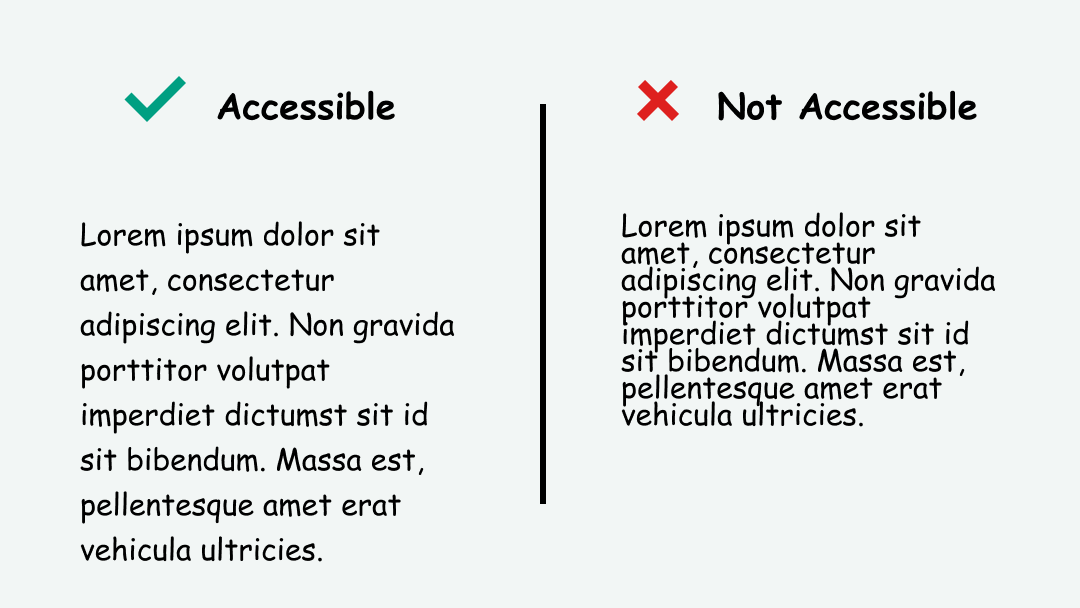
Justified text refers to when the text is fully justified, which is a common design pattern from newspaper print. Justified text aligns text to both the left and right at the same time. This creates gaps in the text sometimes referred to as “rivers of white” that make it difficult to read.
Instead, align text in one direction (in English, left-aligned text is recommended since the language reads left to right).
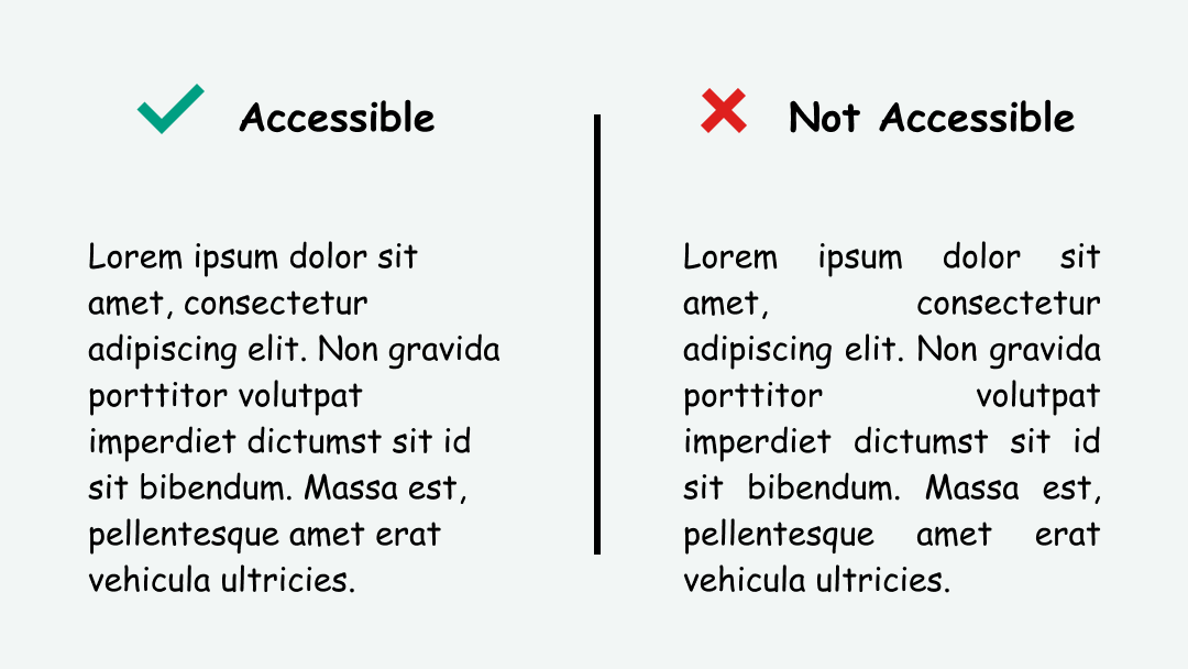
Line Height and Paragraph Spacing
The purpose of line and paragraph spacing is to create space between the text. The extra room helps separate the text and makes it easier to read. Leading, also known in graphic design as line height, should be at least 1.5 (in my personal opinion, anywhere between 1.35 - 1.5 is acceptable). Paragraph spacing should be at least 1.5x larger than line height.
Text Can Be Resized
According to WCAG, text should be able to be resized without assistive technology up to 200 percent in a way that does not require the user to scroll horizontally to read a line of text on a full-screen window.
Horizontal scrolling makes it difficult to read because the user has to move back and forth on the screen. This can be difficult if they have a visual or motor disability, and quickly becomes tedious and frustrating.
To prevent overflow, use CSS to set the container width to the full width of the viewport.
.container {
max-width: 100vw;
}
Text Spacing
WCAG recommends that text spacing follows these best practices:
- Line height (line spacing) to at least 1.5 times the font size;
- Spacing following paragraphs to at least 2 times the font size;
- Letter spacing (tracking) to at least 0.12 times the font size;
- Word spacing to at least 0.16 times the font size.
For line height and paragraph spacing, refer to the section above.
Here are some resources on letter spacing (tracking) and word spacing (kerning):
Interesting Further Reading
For further advice on text presentation best practices, I highly recommend the Dyslexia friendly style guide.
How to Test This
- Evaluate the text styles for colors, width, alignment, andline spacing (leading) - this can be done by evaluating the CSS styles in Chrome dev inspect tools
- Use the zoom controls in the browser to zoom up to 200 percent. Make note if any horizontal scrolling is needed to read.
- Recommended to test with people with visual disabilities (Blind/visually impaired people with functional sight and Dyslexic people) in order to measure how easy to read the text is