This page is in progress -
Why This is Important
Responsive layouts are accessible to people with low vision, physical disabilities, and to a wide variety of screen sizes and devices.
Blind and visually impaired people use screen readers to interact with websites and apps. A screen reader is a type of assistive tech that converts things on screen to audio and/or braille. It's important that things are understandable and interactive to screen readers.
Keyboard accessibility is essential for people who do not use a computer mouse (which might be because they have unpredictable or very specific movement due to a motor disability). Many Blind and visually impaired people also use keyboard interactions in order to use their screen reader.
Error support is accessible to people with a diversity of disabilities. A cognitive disability might affect how a person perceives and understands things. A physical disability might lead to unpredictable movement. Other factors such as environment, stress, and multi-tasking may also lead to errors.
In order to be accessible, gestures and interactions must account for people with physical and motor disabilities, who might have unpredictable or very specific movement.
People with low vision may need to view the page on a larger screen or change the orientation to landscape mode to make elements bigger. People with physical disabilities may mount their mobile device in a fixed orientation (i.e. so that it is always in portrait or landscape mode).
With the expansion of mobile and touch devices, there is now a wide variety of screen sizes to account for. Rather than building for fixed sizes, make sure the layout can respond to different screen sizes.
The WCAG guideline cautions against overflow specifically, which refers to scrolling in both directions. Overflow makes interacting with content difficult and can be avoided using responsive layouts.
This references WCAG criteria 1.3.4 Orientation (Level AA) and 1.4.10 Reflow (Level AA).
Level AAA compliance is considered more difficult to meet because it requires more resources to fulfill. It also might encompass conflicting access needs (meaning what is accessible to some might be inaccessible to others). Use your best judgment of your target audience and your team's capabilities to determine if this is a pragmatic goal to reach.
How to Implement This
How to prevent overflow
Ensure the content is responsive and fits within the viewport (the area of a web page that's visible to the user). If the user resizes the viewport, make sure that this doesn’t hide content or cause scrolling in two directions.
Here is CSS for a container that is constrained to the full width of the viewport:
.container {
max-width: 100%;
}
.container {
max-width: 100vw;
}
Here is CSS for a container with decorative elements that will extend beyond the viewport:
.container {
position: absolute;
top: 0;
right: 0;
bottom: 0;
left: 0;
overflow: hidden;
}
How to design for responsive layouts
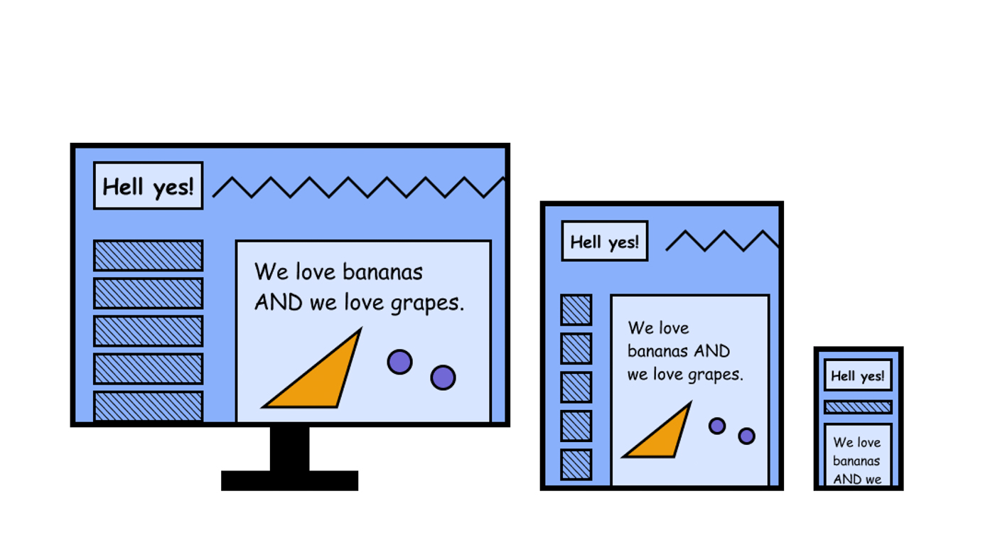
A responsive layout ensures that the same content can be displayed across multiple viewport sizes without it looking weird or without content mysteriously disappearing.

Typically, responsive grid column widths don't change significantly, but the number of columns does change per viewport size. This usually means 12 columns for desktop sizes, 8 columns for tablet sizes, and 4 columns for mobile sizes.
Here are helpful articles for building and using responsive grids:
- Responsive grids and how to actually use them
- How to build a responsive grid system
- How to customize the grid in Sketch
- How to customize the grid in Figma
It is also recommended CSS grid instead of an HTML grid, which follows a general rule to use HTML for content and structure and CSS for styling. This clean separation is more accessible for screen readers and allows for style and brand updates more smoothly.
Custom design per viewport
There are some specialty cases where a completely different layout applies to a different viewport size. This may be necessary for a specific type of presentation and interaction. For example, data tables are great for viewing and editing a large amount of information at once. This is optimal for a desktop viewport, but if it's very difficult to maneuver on a mobile device (especially in portrait mode).
How to Test This
- Open the website/app on a computer browser and resize the browser. Make note of any content that is not visible or confusing due to the resize.
- Open the website/app on a tablet. Make note of the same issues.
- Open the website/app on a mobile phone. Turn the phone so that it can be viewed in both portrait and landscape. Make note of the same issues.
- Note: if you do not have smaller devices available for testing, resizing the browser on a computer should suffice. The purpose of the tablet and mobile features are to test how natural the interactions feel on a touch device.