This page is in progress -
Why This is Important
Providing information about errors tells people what went wrong. This is especially supportive for Blind, colorblind, and cognitively disabled people.
Blind and visually impaired people use screen readers to interact with websites and apps. A screen reader is a type of assistive tech that converts things on screen to audio and/or braille. It's important that things are understandable and interactive to screen readers.
Keyboard accessibility is essential for people who do not use a computer mouse (which might be because they have unpredictable or very specific movement due to a motor disability). Many Blind and visually impaired people also use keyboard interactions in order to use their screen reader.
Error support is accessible to people with a diversity of disabilities. A cognitive disability might affect how a person perceives and understands things. A physical disability might lead to unpredictable movement. Other factors such as environment, stress, and multi-tasking may also lead to errors.
In order to be accessible, gestures and interactions must account for people with physical and motor disabilities, who might have unpredictable or very specific movement.
If the user makes a mistake and there’s no explanation of what happened, this leads to a great deal of confusion and frustration. The website/app must identify the error and describe it so that the user understands what went wrong.
The error messaging must be available to screen readers in order to be accessible to Blind and visually impaired people. It should not be conveyed through color alone to be accessible to colorblind people. And it should identify the error in a clear and approachable way for people with cognitive disabilities.
This references WCAG criterion 3.3.1 Error Identification (Level A).
Level AAA compliance is considered more difficult to meet because it requires more resources to fulfill. It also might encompass conflicting access needs (meaning what is accessible to some might be inaccessible to others). Use your best judgment of your target audience and your team's capabilities to determine if this is a pragmatic goal to reach.
How to Implement This
There are a few different types of error messages that you can choose one depending on the context. 3 major types are inline messages, banner notifications, and page errors.
Inline Message
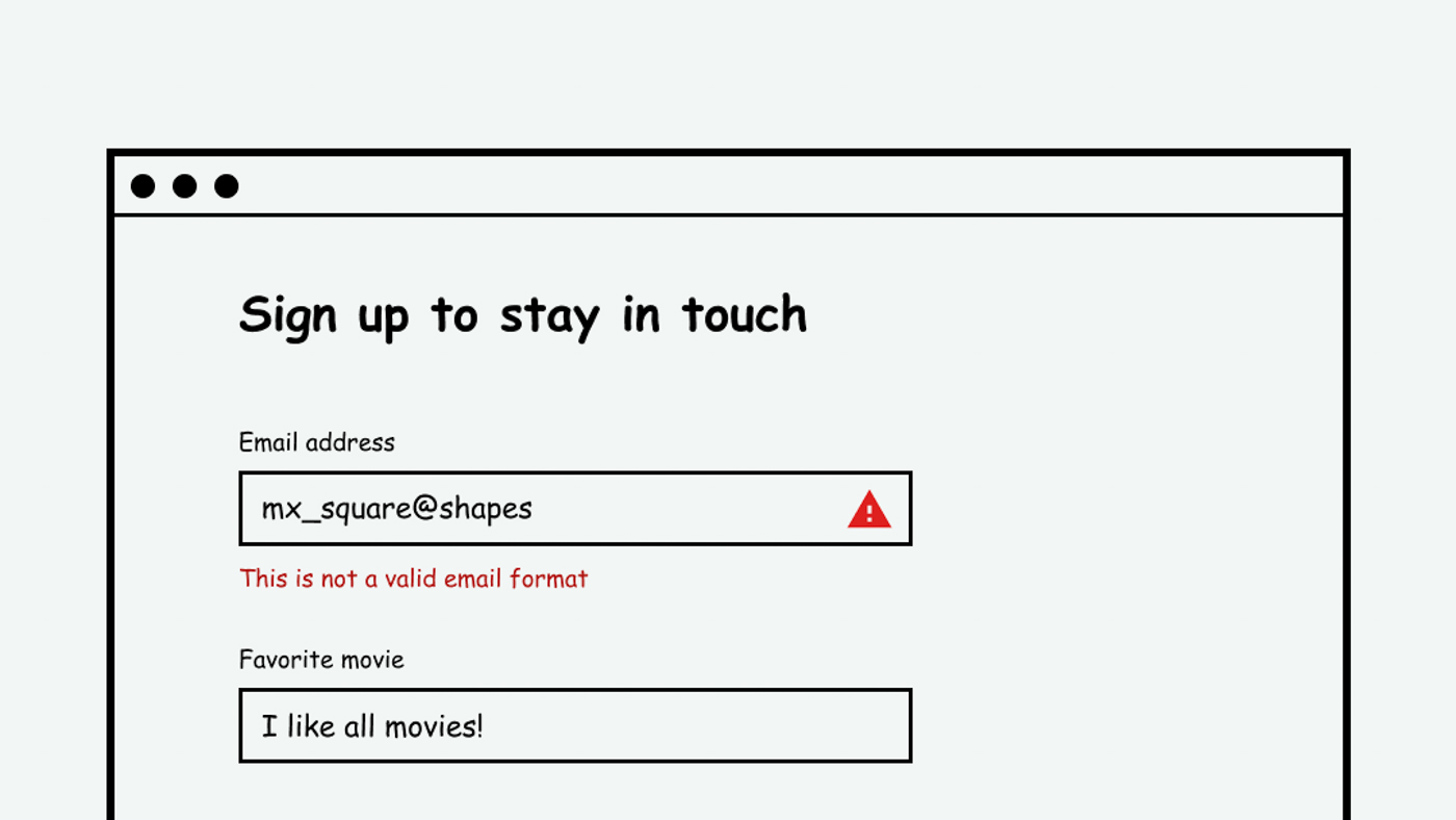
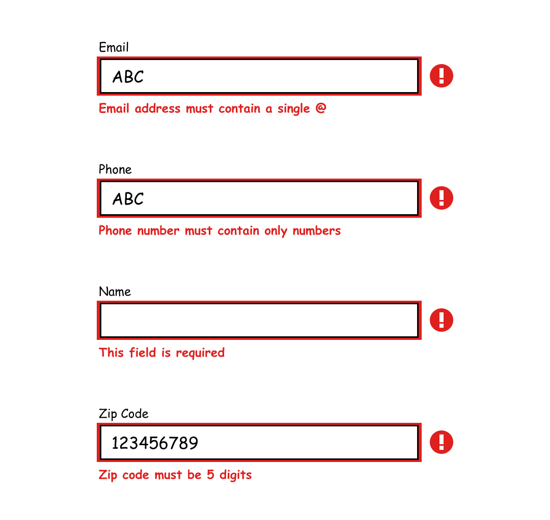
An inline error message works well for user inputs (such as text fields, checkboxes, radio buttons, dropdowns, etc.) This helps identify where exactly the error occurred. It’s important that this message is colorblind accessible, meaning it doesn't use color alone to convey that there's an error. For example, just outlining the text field in red wouldn't be accessible. Use text to explain the error and iconography to draw attention to it.
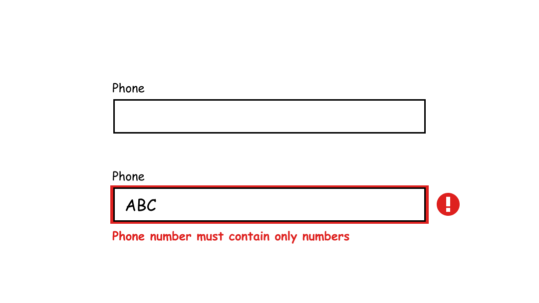
Inline input errors are very helpful in a long form because there might be multiple errors on the page. Specific error messaging also helps people know how to address the error. If the error only said, “Invalid input, please try again,” while that does specifically identify the error, it doesn’t help the user very much. For example, the messaging could say that a certain field being required or that a zip code must be 5 digits long.
Banner Notification
If the error is not specific to one input, but rather applies to the entire system or page, a banner notification works well. It draws the user’s attention without covering up too much content. In order to provide further support, the banner could include buttons and links to help address the error.
It’s important that the notification is screen reader accessible. This can be accomplished using the tabindex, role, or ARIA-live attribute. For more, refer to- Define status messages in markup.
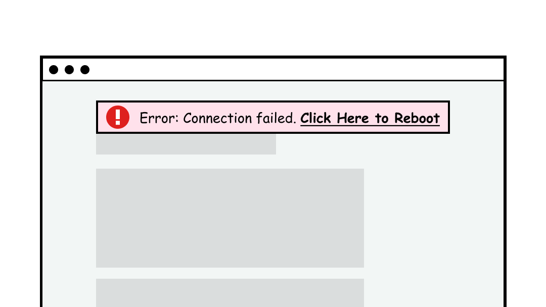
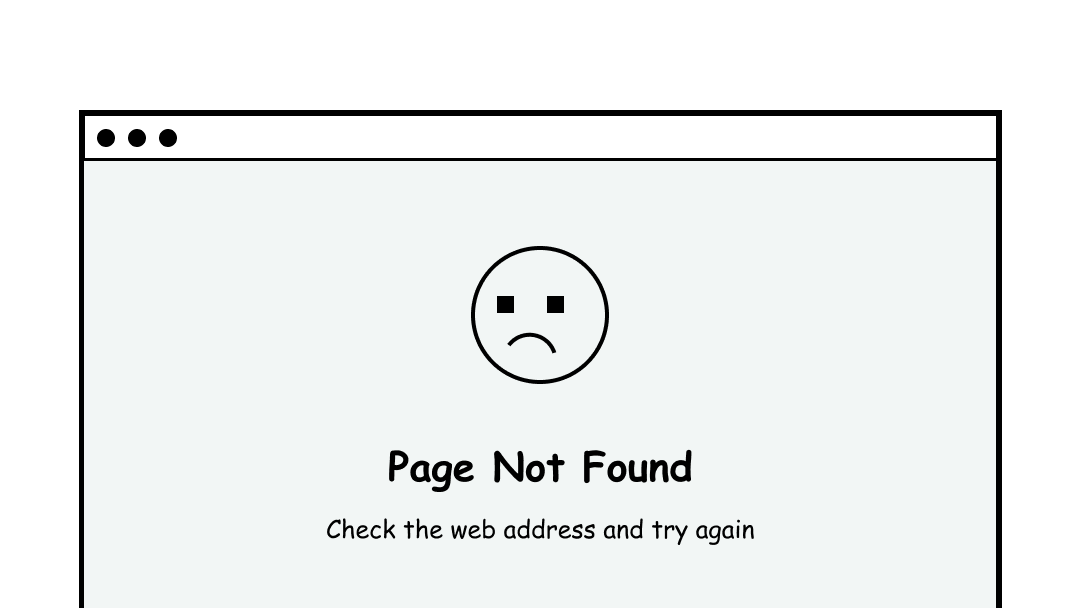
Page Error
The page itself can also be the entire error message. This works well if the page url cannot be found or if the connection is so poor that no content can be loaded. Playful imagery and messaging is sometimes helpful in this scenario because the user is probably frustrated that they’ve landed here.
Interesting Further Reading
Digital A11y recommends the following tips for creating accessible error messaging:
- Make sure that errors are in text.
- Don’t just use color or visual cues to point out form errors.
- Use aria-describedby to bind the form control with the error programmatically.
- Don’t disable the submit button! Some websites disable the submit button & will only enable it if the form is filled appropriately. This is bad practice.
- Provide necessary instructions & be as specific as possible with the errors so that users can take necessary action.
- Make sure that errors are distinguished from the regular text on the web page.
Here are some links to further documentation:
- Digital A11y: Understanding SC 3.3.1 Error Identification
- Level Access: How to Provide Accessible Form Error Identification
- Harvard Digital Accessibility: Provide helpful error messages
How to Test This
- Enter incorrect data into each input and make note of any error messages that appear
- Simulate system errors such as bad connection by turning off the wifi
- Make sure the error messages are easy to understand, colorblind accessible, and screen reader accessible