This page is in progress -
Why This is Important
Consistent UI (User Interface) components are easier to understand and interact with, especially for people with cognitive and visual disabilities.
Blind and visually impaired people use screen readers to interact with websites and apps. A screen reader is a type of assistive tech that converts things on screen to audio and/or braille. It's important that things are understandable and interactive to screen readers.
Keyboard accessibility is essential for people who do not use a computer mouse (which might be because they have unpredictable or very specific movement due to a motor disability). Many Blind and visually impaired people also use keyboard interactions in order to use their screen reader.
Error support is accessible to people with a diversity of disabilities. A cognitive disability might affect how a person perceives and understands things. A physical disability might lead to unpredictable movement. Other factors such as environment, stress, and multi-tasking may also lead to errors.
In order to be accessible, gestures and interactions must account for people with physical and motor disabilities, who might have unpredictable or very specific movement.
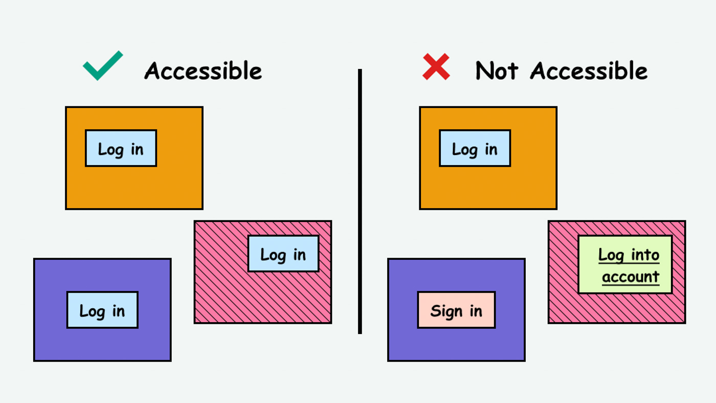
Components that do the same thing should also visually look the same. If the same component looks different on different pages, it’s confusing and increases the cognitive load on people learning how to interact with the website/app.
This references WCAG criterion 3.2.4 Consistent Identification (Level AA).
Level AAA compliance is considered more difficult to meet because it requires more resources to fulfill. It also might encompass conflicting access needs (meaning what is accessible to some might be inaccessible to others). Use your best judgment of your target audience and your team's capabilities to determine if this is a pragmatic goal to reach.
How to Implement This
Use a Design System
The best way to make sure the user interface is visually consistent is to use a design system. A design system is a source of truth for visual styles, layout, and components and comes with guidelines for when and how to use them.
This way of thinking is also known as Atomic Design, a concept focused on designing systems instead of individual pages. You start with components at the “atomic” level (e.g. titles, body text, buttons, etc.) and use these components to build larger, more complex components.
Here are some guidelines on how to create a design system:
- Design Systems: Step-by-Step Guide to Creating Your Own
- Starting a design system in a start-up
- Designing your design system
Here are some examples of design systems:
Consistent Screen Reader Text
Make sure that components that do the same thing also have the same screen reader label.
In this example, the login button is labeled differently across 3 different pages:
<title>About Us</title>
<button id="logIn">Log In</button>
<title>Blog</title>
<button id="signIn">Log In</button>
<title>Pricing</title>
<button id="userLogIn">Log In</button>
In order to be accessible, components with the same functionality should all be labeled the same.
Websites and applications can get complex pretty quickly with a large amount of text to track. Here are some tools to help manage the copywriting system-wide:
Further Reading
How to Test This
- To visually compare the UI components, create an inventory of all pages. Make note of any inconsistencies.
- To help prioritize which components need attention, conduct user testing in order to find out what parts are confusing.
Currently seeking recommendations for how to best test the consistency of screen reader components. If you have any recommendations, please reach out in the form below!